


[Case Study]
Hanover
[About]
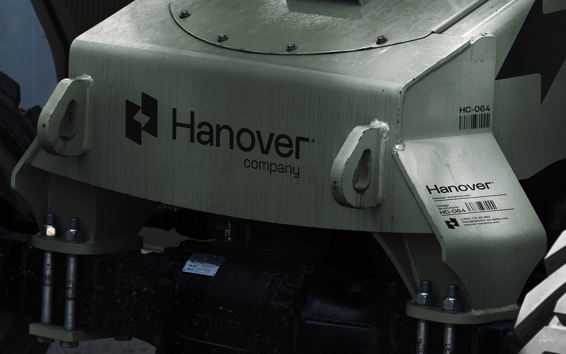
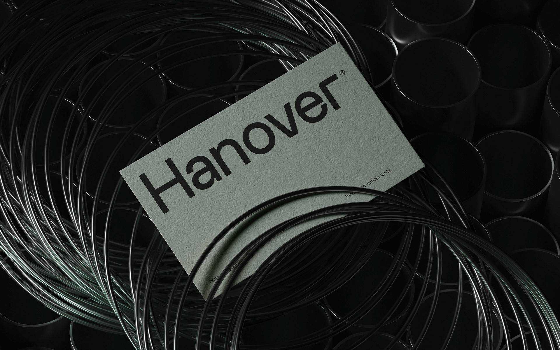
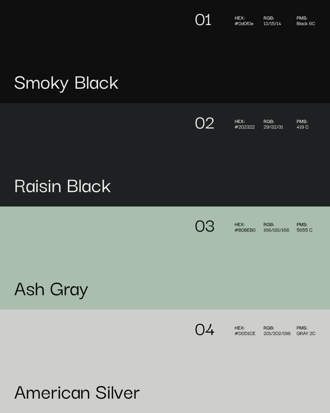
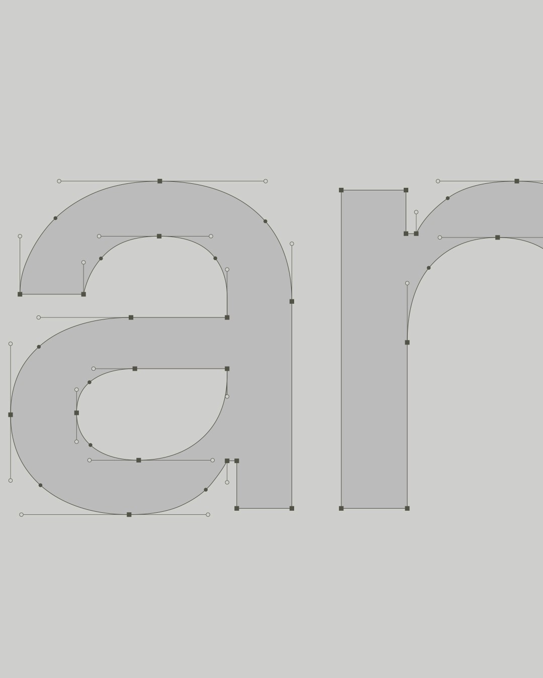
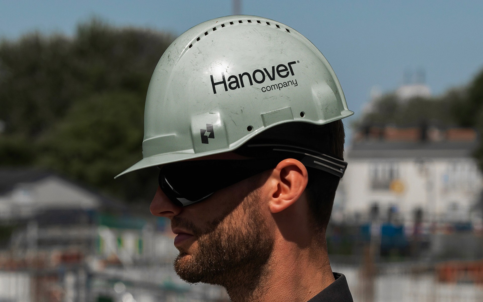
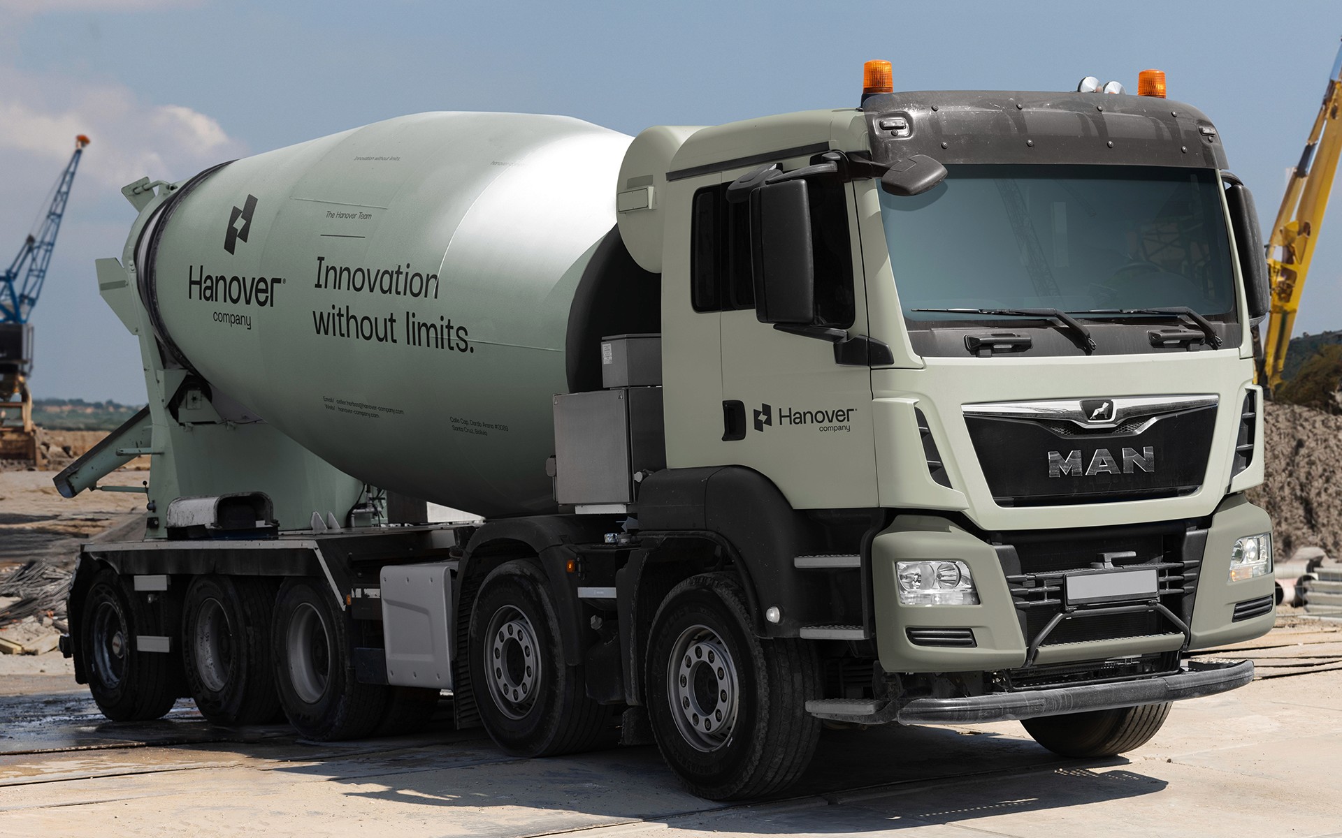
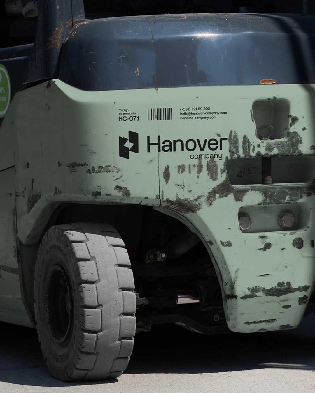
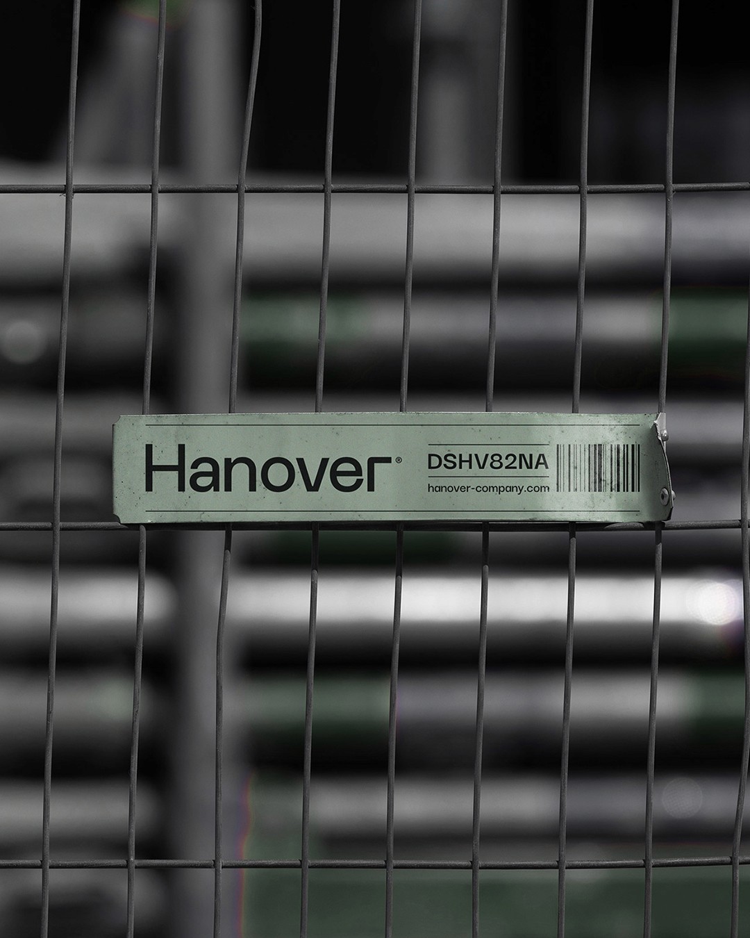
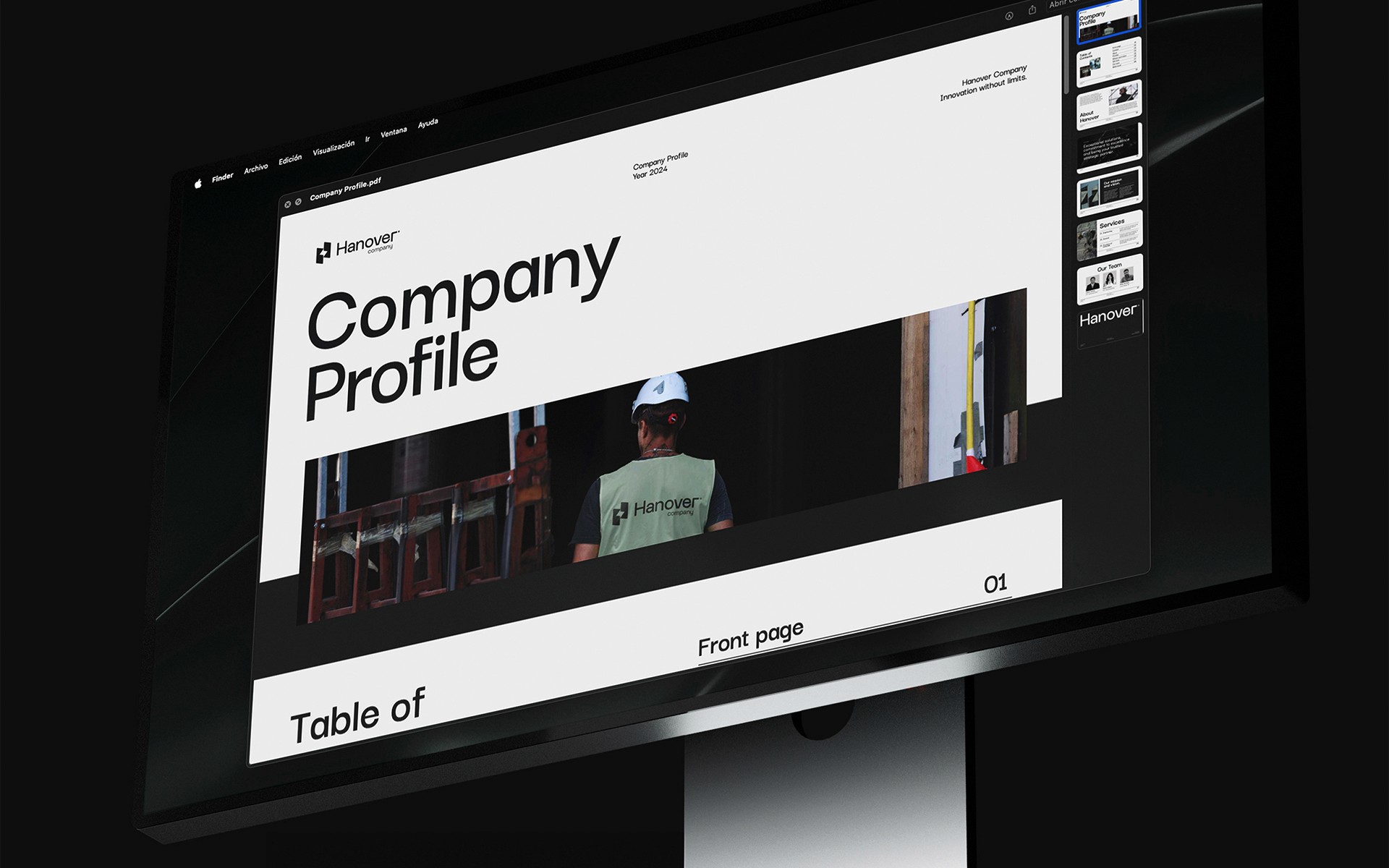
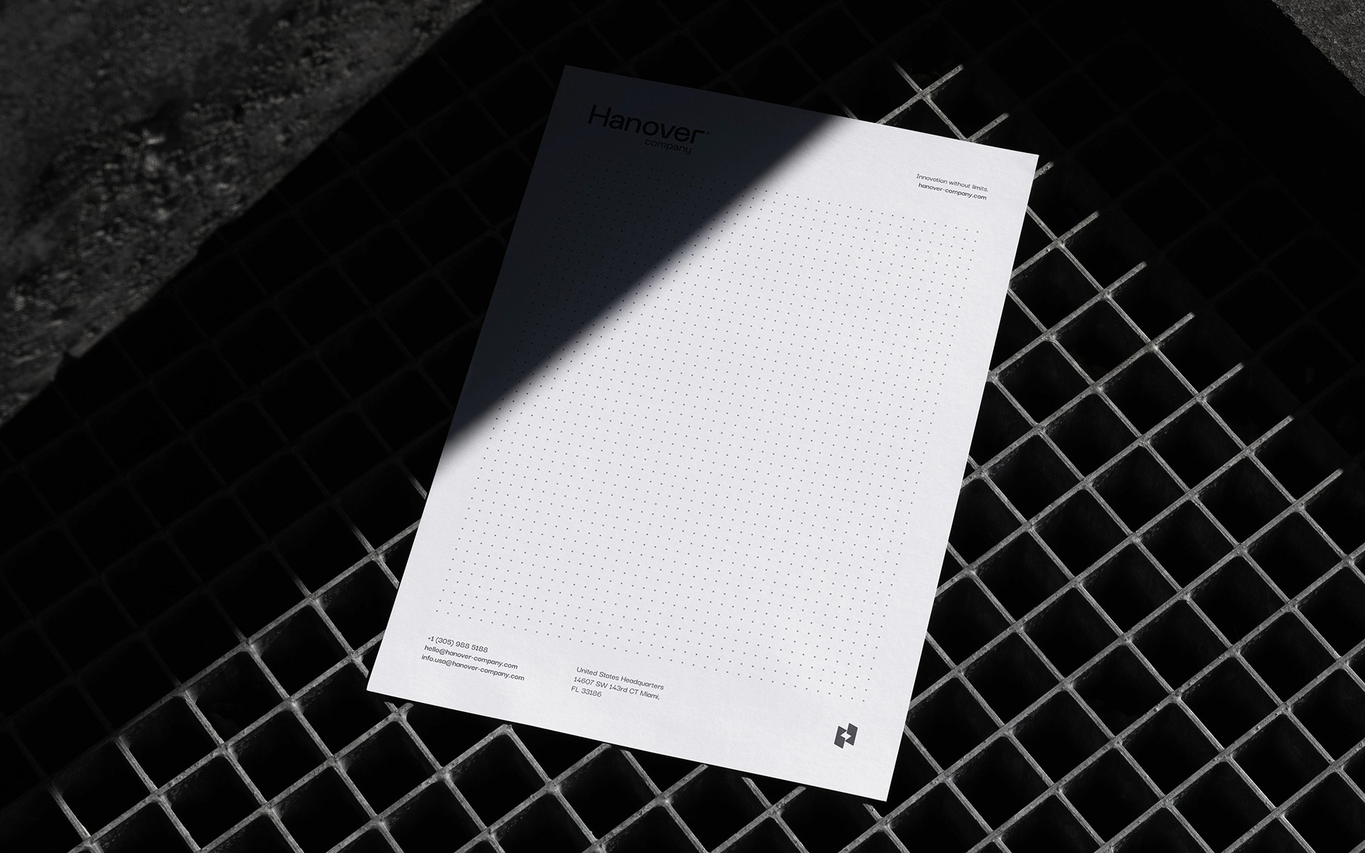
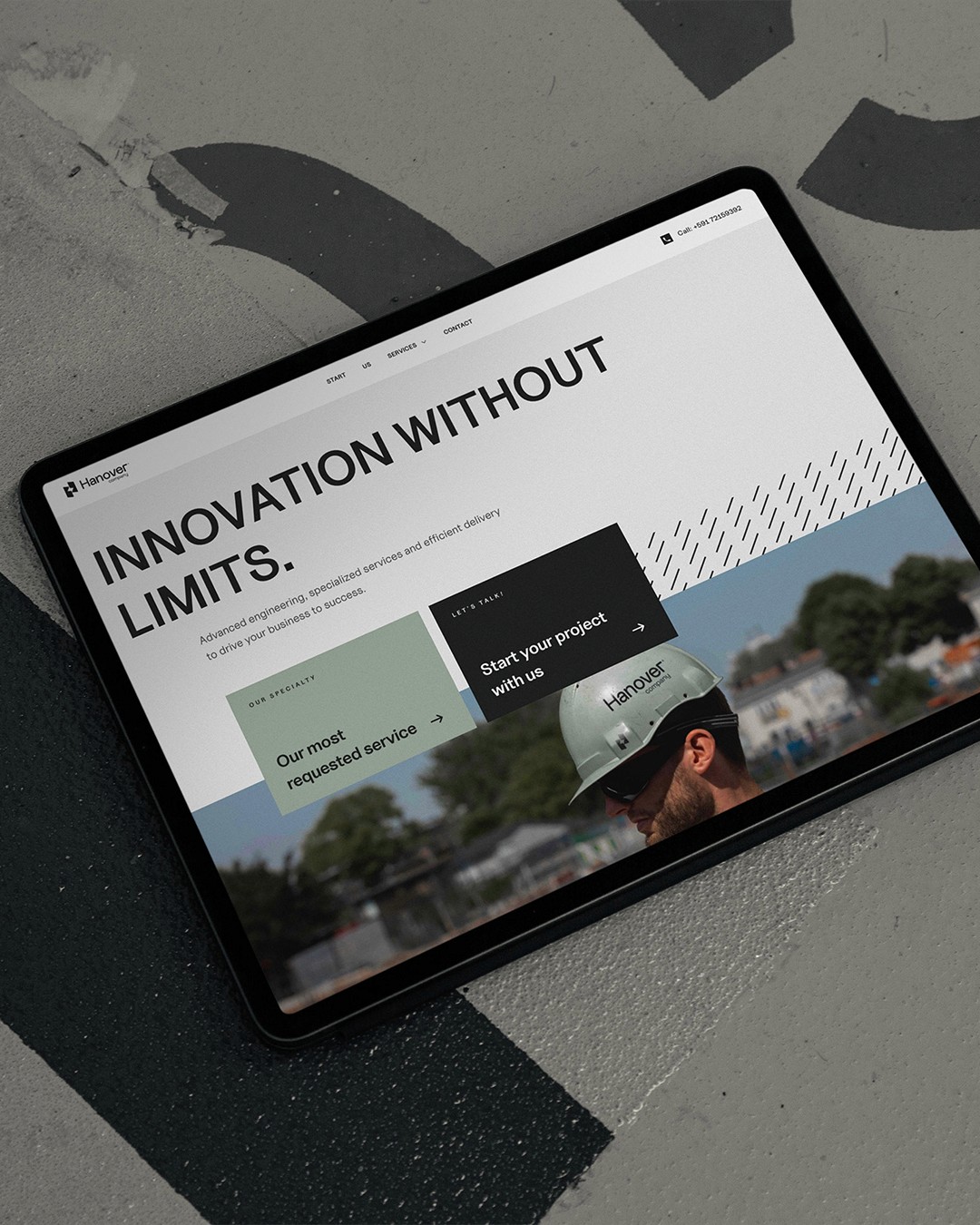
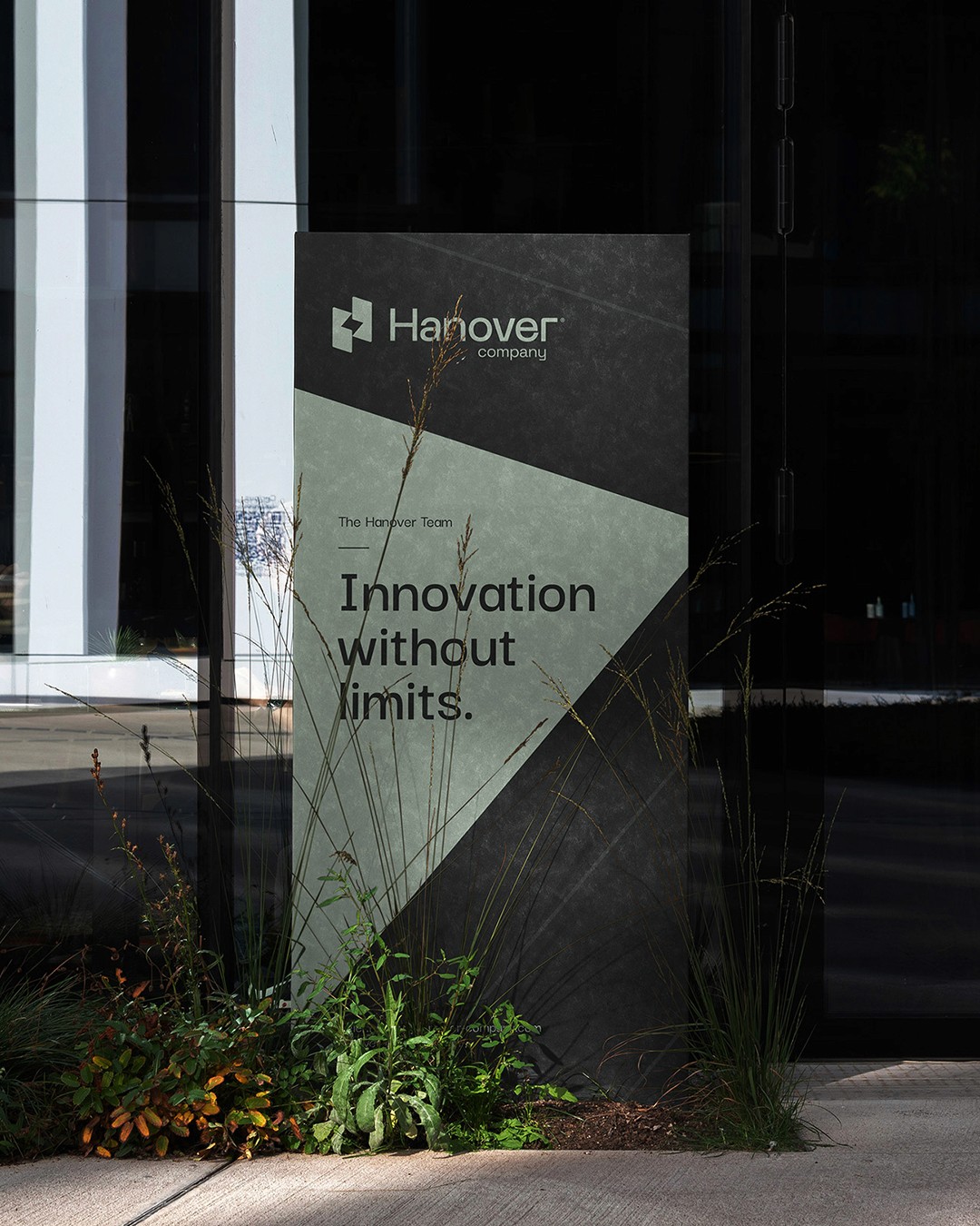
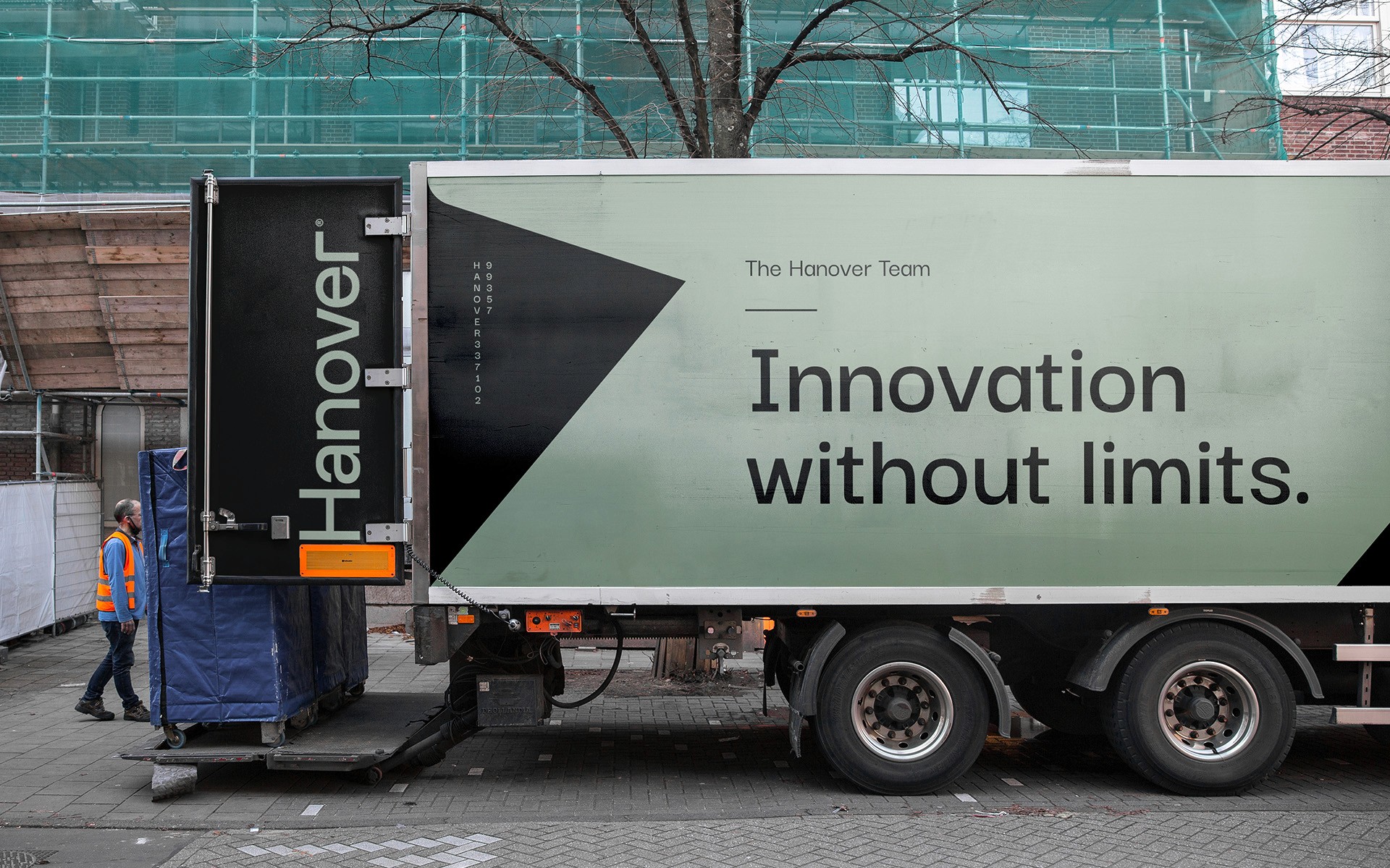
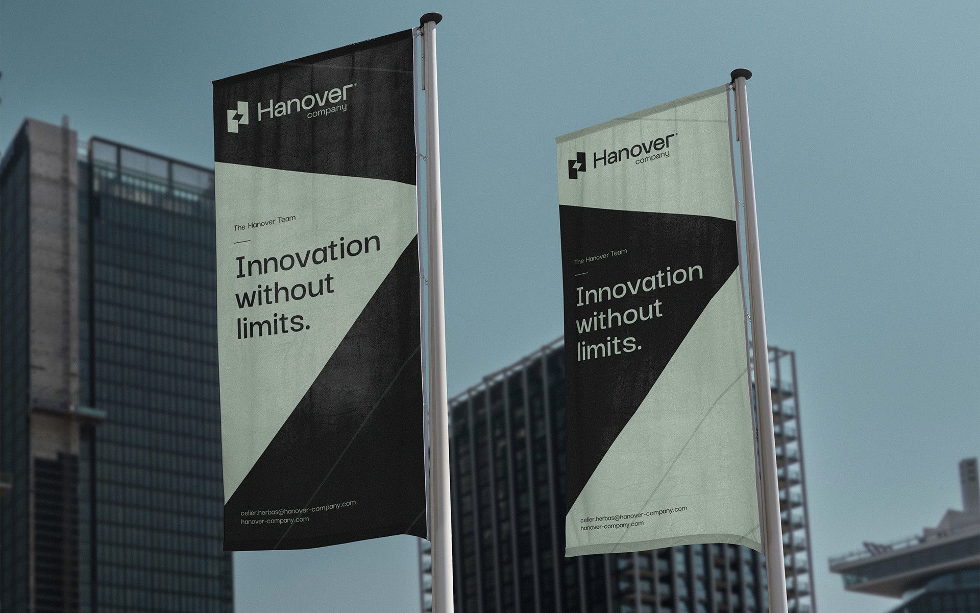
The engineering and materials supply industry runs on trust — clients need to know that the partner behind every project is as solid as the materials they provide. Hanover came to us needing a brand that could reflect exactly that: precision, reliability, and a professional presence that stands out in a competitive, technical sector. Every visual decision, every word, every touchpoint contributes to a feeling that either earns that trust or falls short of it. Hanover needed more than a logo — it needed an identity that could hold up across construction sites, vehicle fleets, safety equipment, and corporate documentation, all while feeling unmistakably professional. We developed a complete brand identity and corporate website that positions Hanover as a serious, established player in its industry. Every visual decision — from typography to color to material application — was crafted to project strength and consistency across every touchpoint the brand appears on, from a hard hat to a cement truck to a company profile document. The result is a brand that doesn't just look professional. It feels dependable. A visual identity that commands respect on-site and online, giving Hanover the presence it needed to stand out in its sector.
[Characteristics]
Service:
Brand Identity, Web Design
Client:
Hanover
Industry:
Engineering
Year:
2025
Country:
United States
[Selected Work]
