


[Case Study]
Naventis
[About]
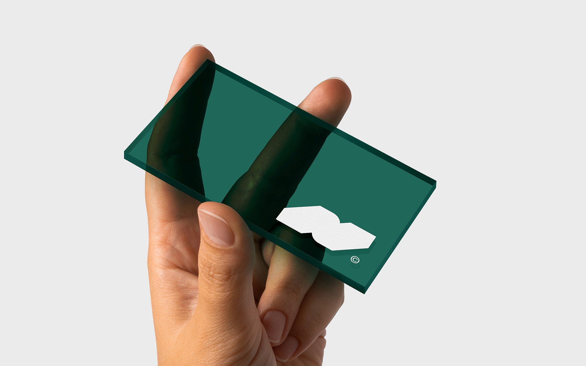
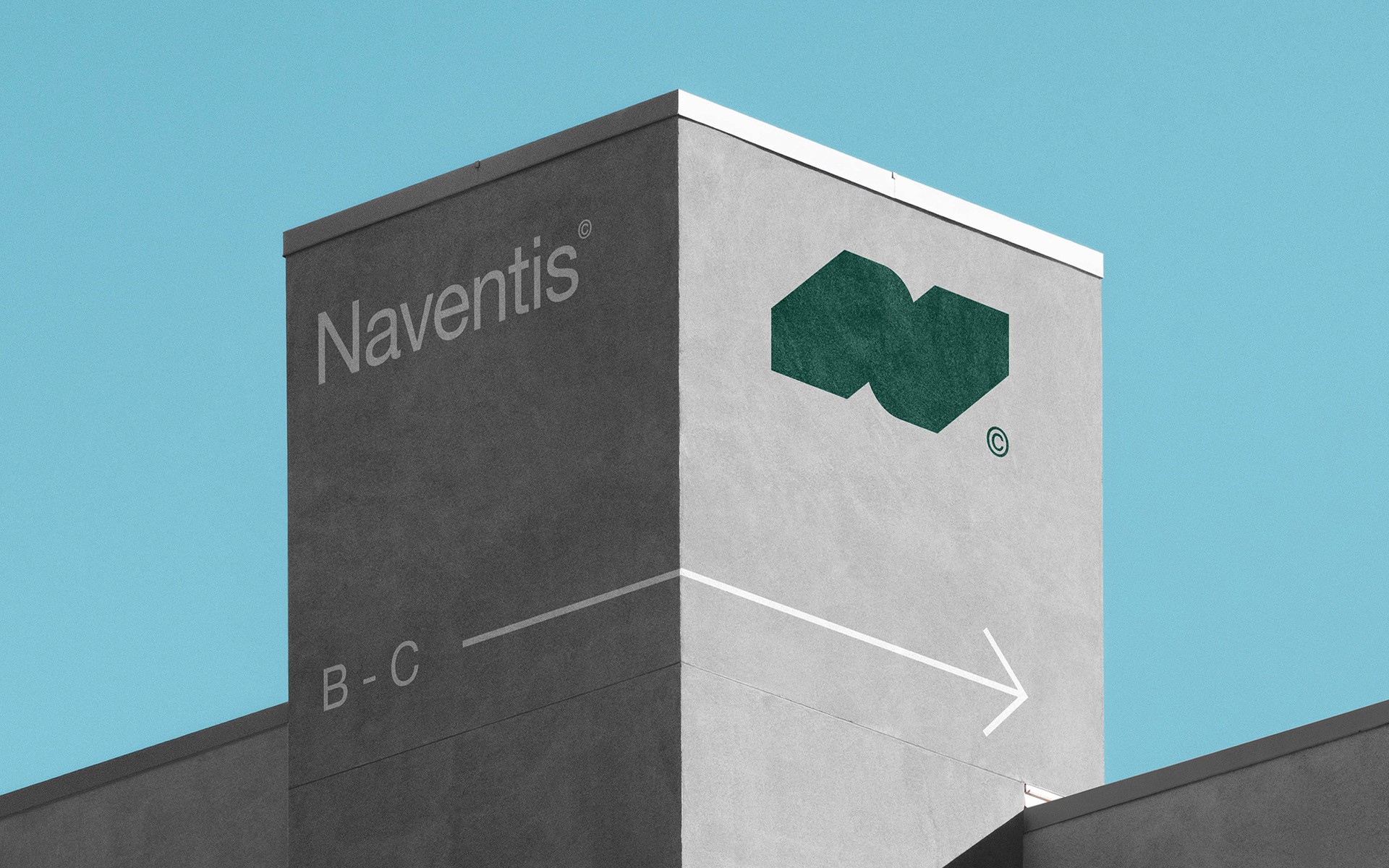
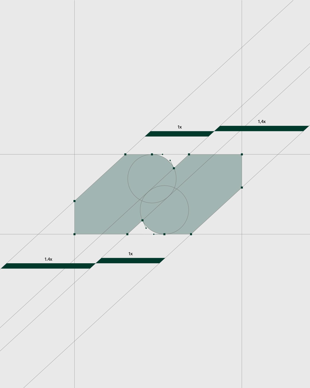
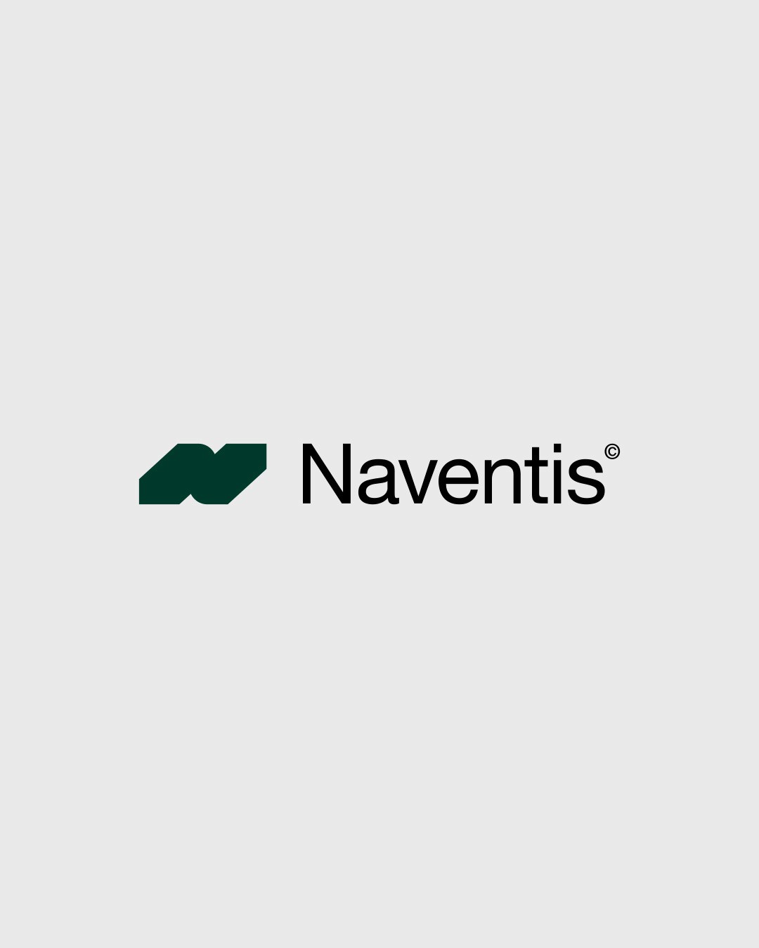
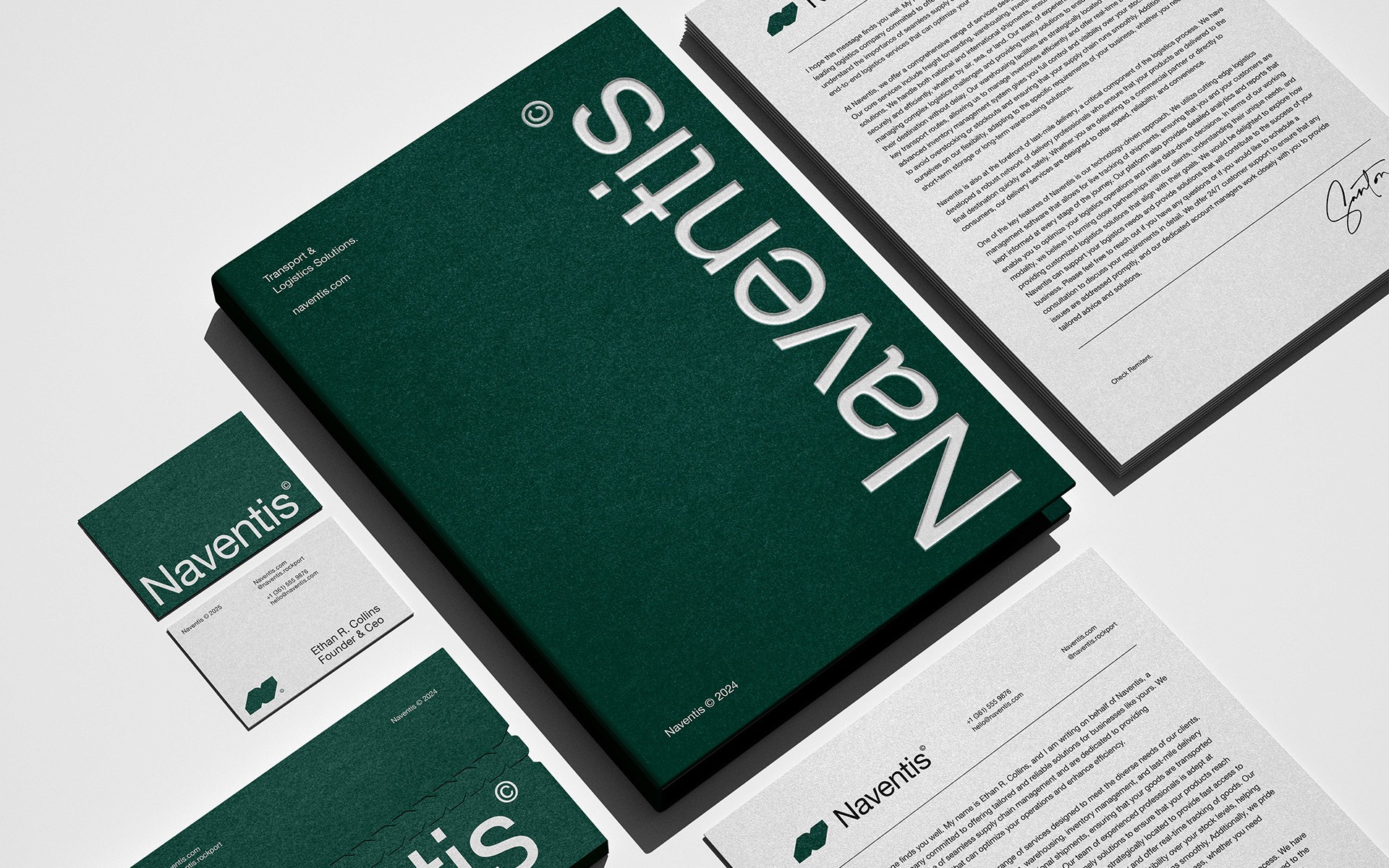
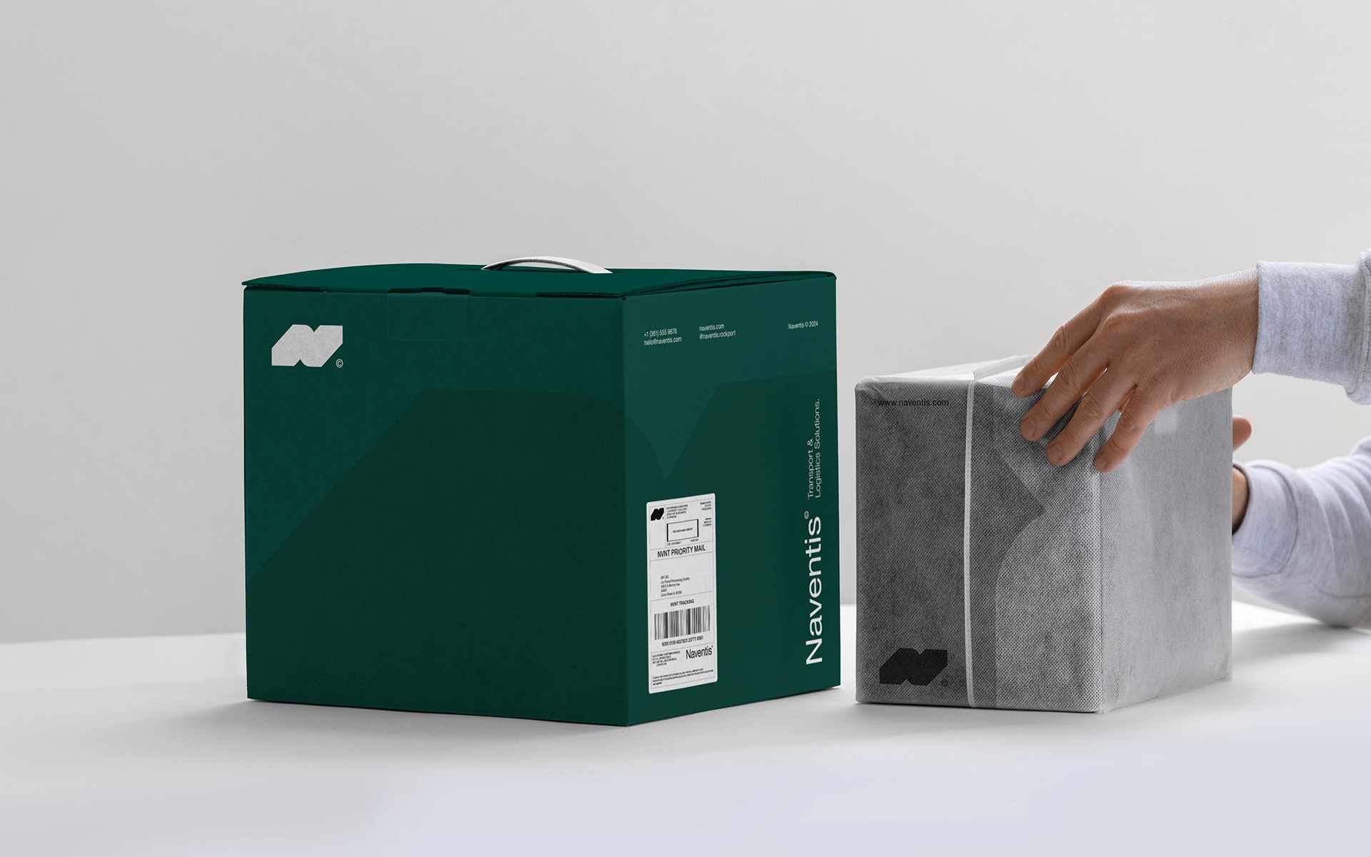
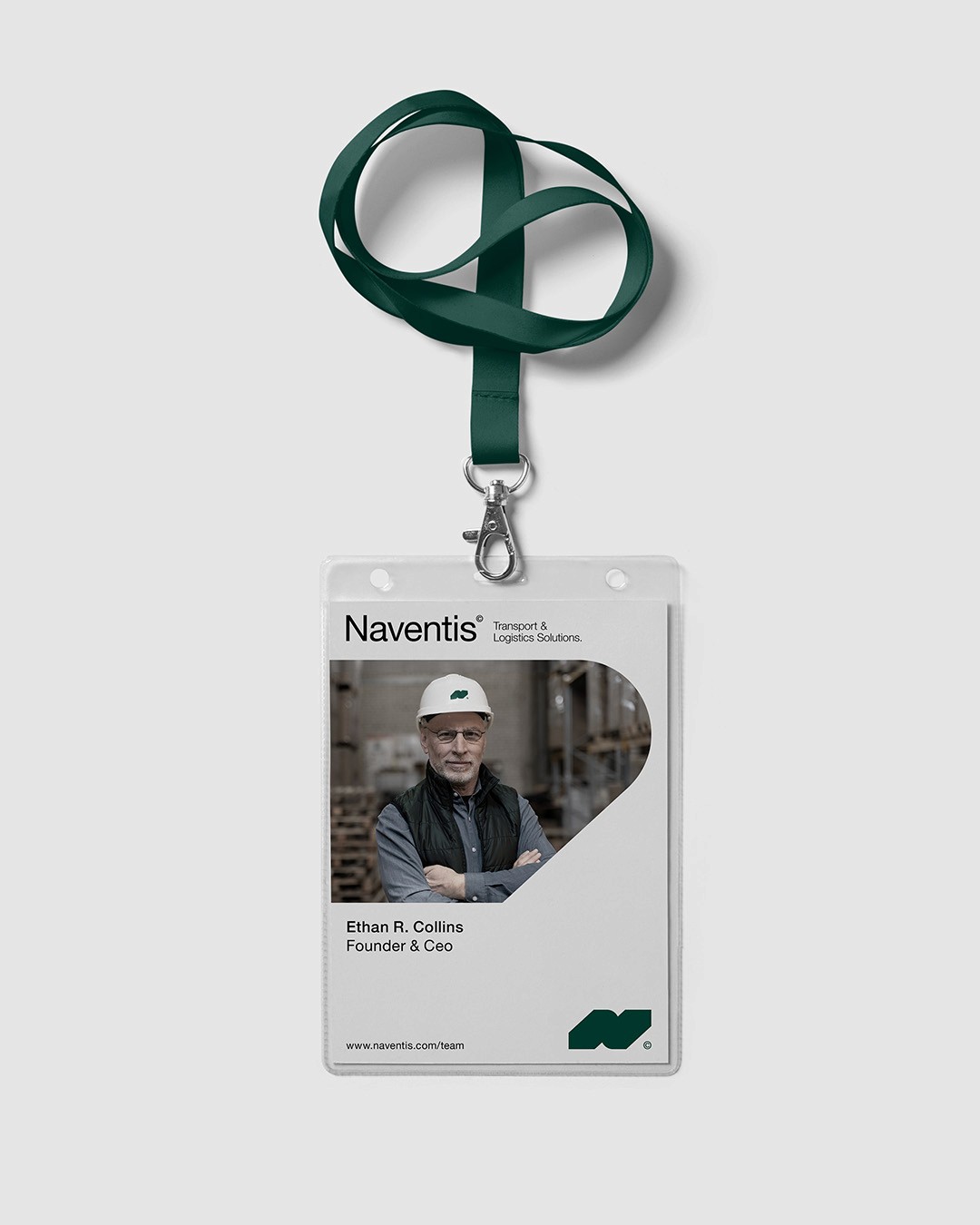
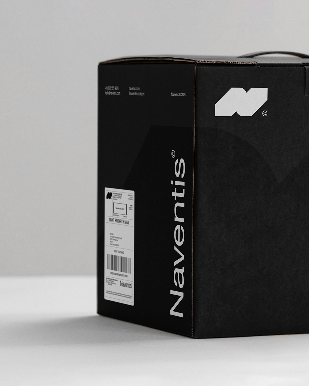
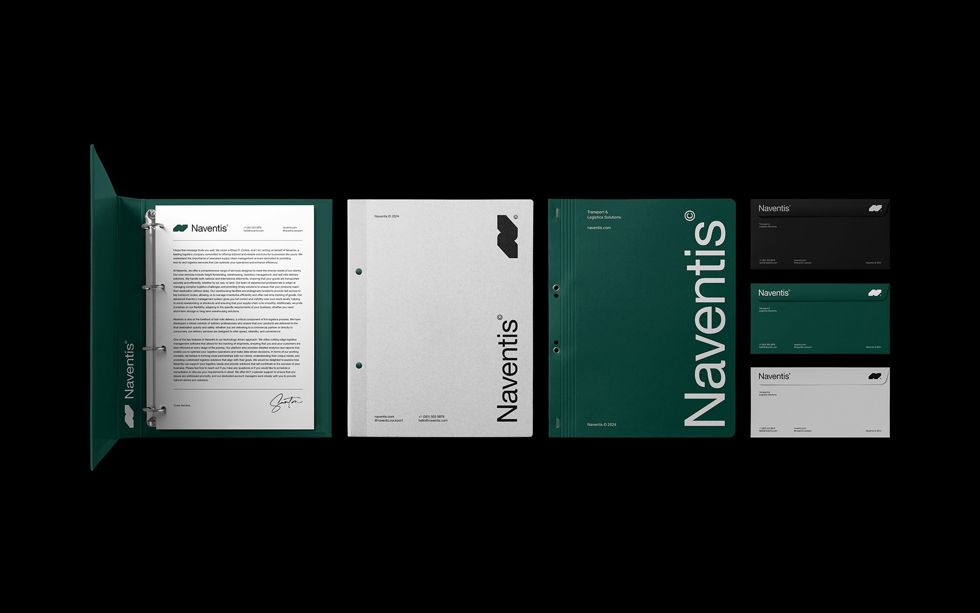
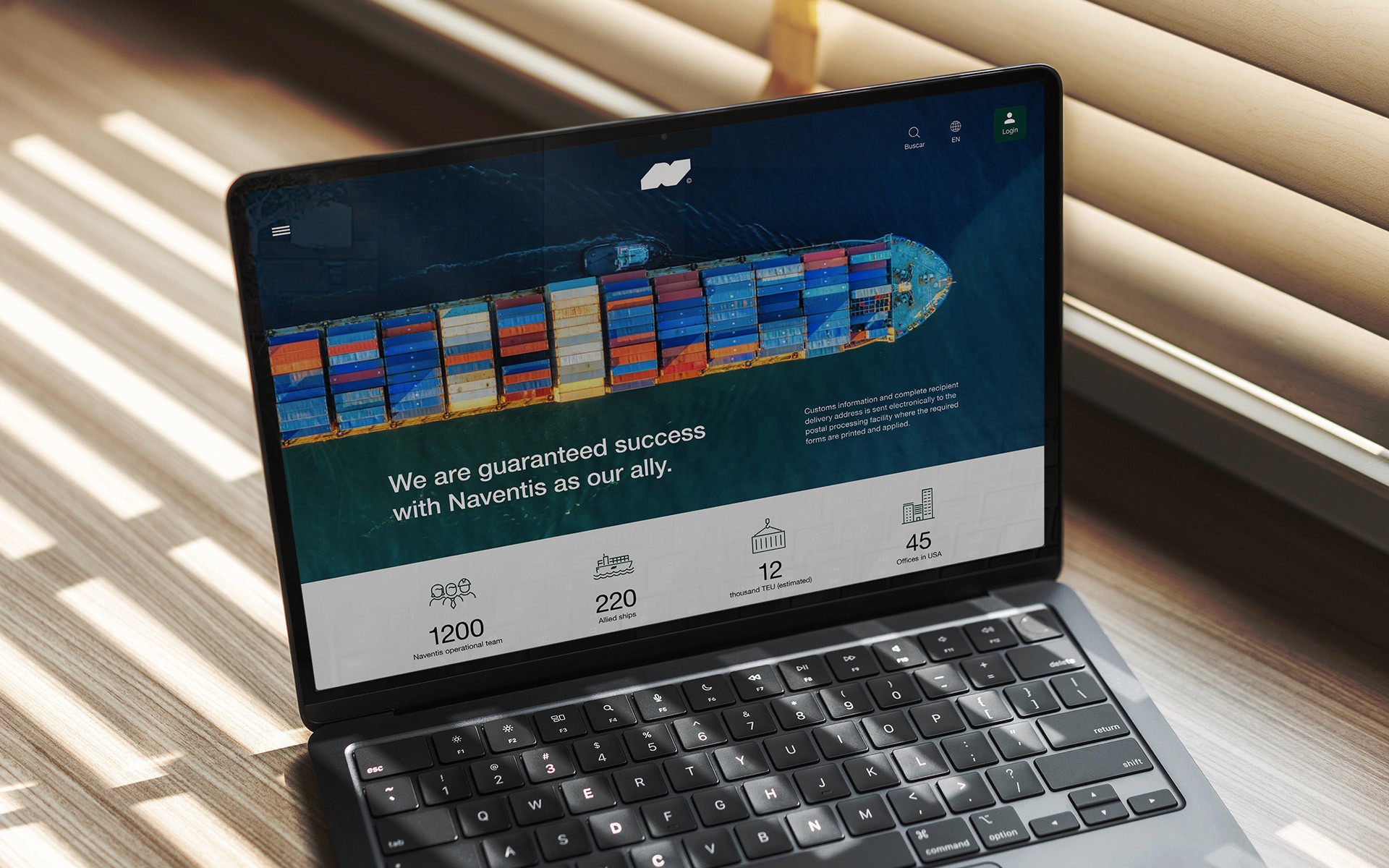
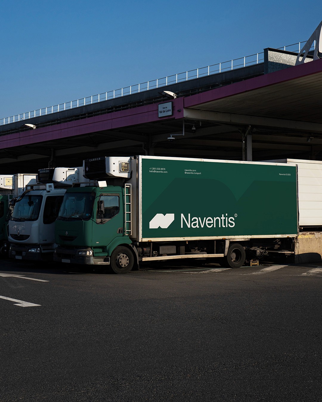
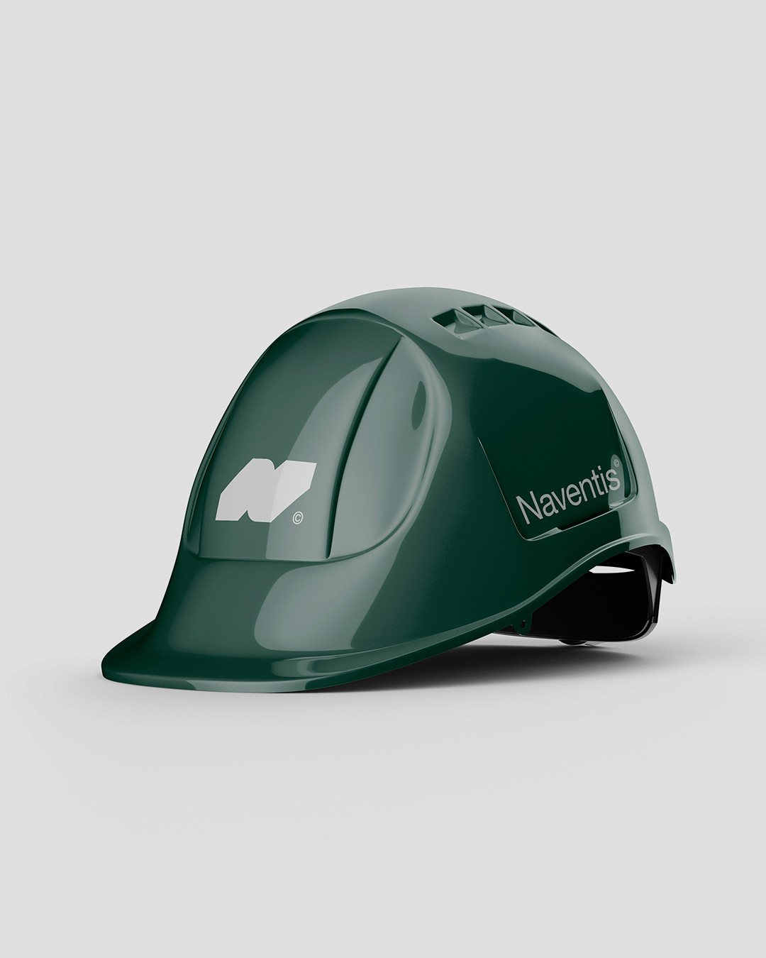
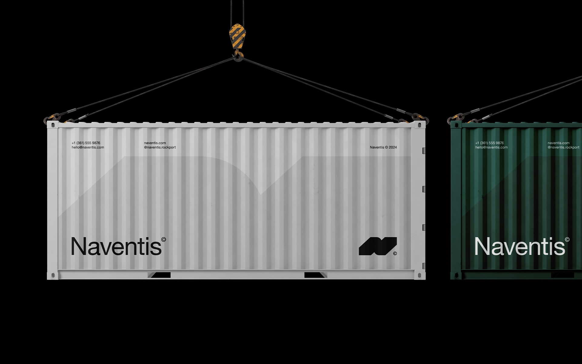
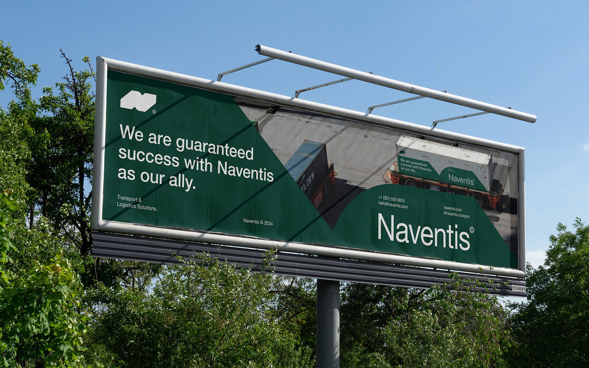
Logistics sells more than transportation — it sells the feeling of certainty in a chain full of moving parts. The moment a prospective client hands over their cargo, they're already measuring whether this partner can be trusted with the details that matter. Every visual decision, every word, every touchpoint contributes to a feeling that either earns that trust or falls short of it. Naventis was built around this idea from the start. This concept project explores how a logistics brand could communicate reliability, precision, and constant motion from the very first interaction. It needed more than a logo — it needed a complete brand world that could translate seamlessly from a shipping container to a driver's uniform, from a tracking dashboard to a highway billboard. We developed a complete brand identity and digital experience that positions Naventis as an ally in its own right. Every visual decision — from typography to color to motion — was crafted to evoke the feeling of momentum, of stepping into a system where every shipment has been considered and nothing has been left to chance. The result is a brand that doesn't just look dependable. It feels it. A visual system that commands trust without demanding it, and communicates precision without ever having to say so.
[Characteristics]
Service:
Brand Identity, Web Design
Client:
Naventis
Industry:
Logistics
Year:
2025
Country:
Canada
[Selected Work]
